Cannabis Life - Wellness Brand

Redesigning an e-commerce’s interface and shopping experience
My Role: UI/UX Designer on a cross-departmental team of Developers, Graphic Designers, and Marketing
Timeline: 1 week sprint
Tools: Figma, Jira, Microsoft Teams, Pen&Paper
Previous Homepage Designs vs My Redesigns
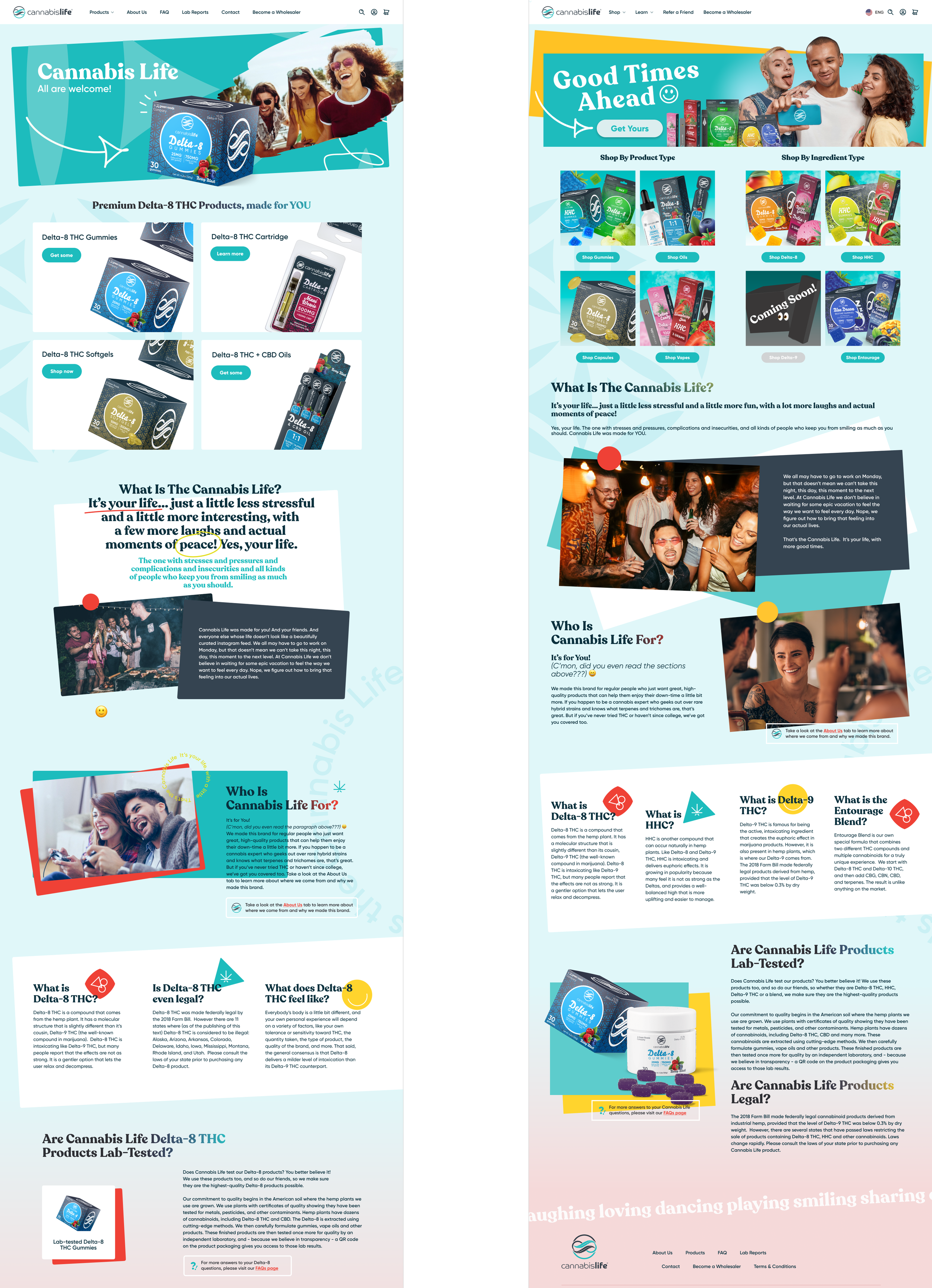
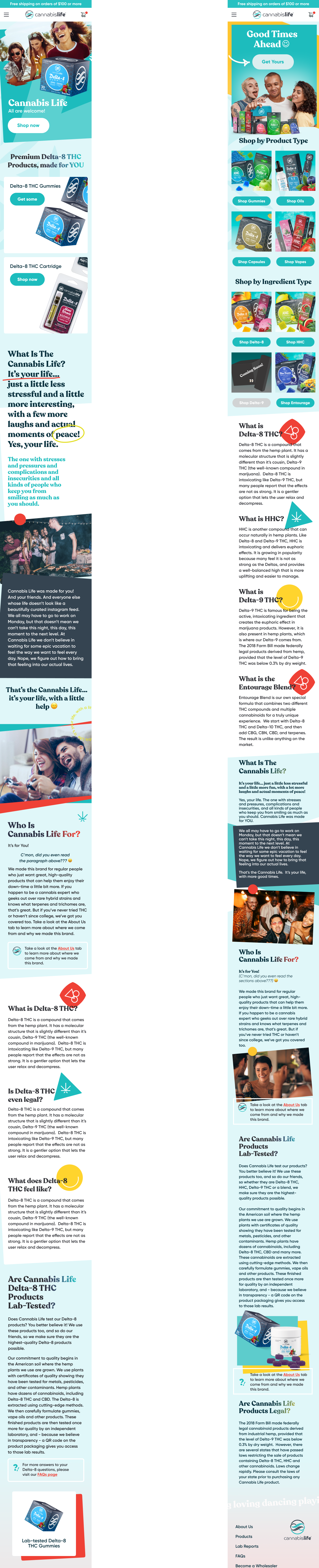
Before Redesign
Previously, Cannabis Life only had a handful of free standing items for sale on one page. Once an influx of products were green-lit to be sold, the need to categorize arose.
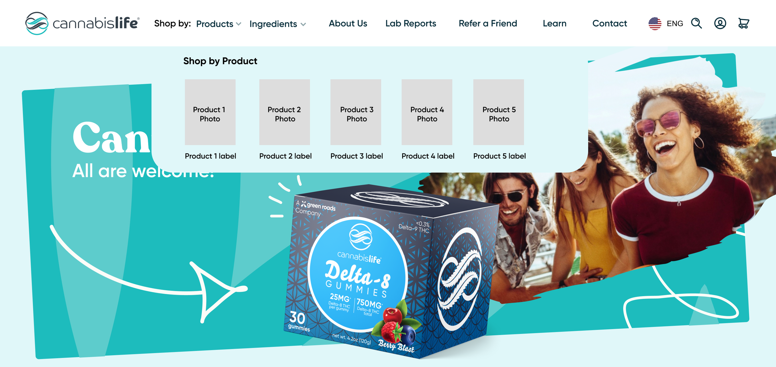
To get customers acquainted with the new items, I added navigational features. For example, on the hover state of the “Products” menu in the desktop’s navigation (tap on mobile devices), a clickable product image and name will be shown.

To ensure a natural shopping experience, I added a CTA to the banner that would redirect a customer to the products’ page.
Originally, there was no link to the merchandise in the banner.
Steps Taken to a Successful Redesign
Sketching is my go-to method for breaking down possible wireframes, mapping, visual pieces, and much more. It’s a quick, low-risk system that can bring forth any potential complications or questions.


Data and Research
I compared which factors were proven to make users feel confident versus trapped or lost.
My findings showed that not having breadcrumbs on websites had the lowest user conversions— even when compared to incomplete or overwhelming long breadcrumbs. With that in mind, I added breadcrumbs but avoided over-categorizing. I also reduced the length of the breadcrumbs by omitting redundant or unnecessary links to previous page.
Banner Drafts to Final
The original top navigation had 6 clickable sections with plans to add more. Following design best practices, I aimed to declutter it instead. As I walked the team through my intentions, I informed them that the key amount of elements in a top navigation should be between 3-6. This is because customers are more likely to leave a site which requires them to read through more than that. Additionally, SEO is affected by the navigation bar, because a cleaner and minimal approach facilitates the search engine’s understanding of what your site is, does, and provides. In layman’s terms: less navigation means appearing on more relevant Google searches.
By the third version, I was aiming for smoother and more consistent UX Copy. First, I reduced all of the old menu items into fewer sections, and then I changed all of the titles into verbs.

Show, Don’t Tell

I introduced prototyping to the company with this project to better communicate my ideas to stakeholders during internal presentations. Though I was still available and involved with the development process, the updates went live two weeks faster than usual because of how explanatory the prototype was.
Beforehand, the expectation was that the developers would always know what each button was meant to do. That led to a dragged out coding process due to back and forth questions after handoff. Plus, team members such as the Creative Director, the CMO, and the COO would often be left confused— unable to visualize the intended motions of proposed solutions.

The original wireframes had no specific constraints, naming conventions or organization.
To set any UX Designers that would take over the file in the future up for success, I added auto-layouts and named elements and frames.
Thank You to The Team

Sources:
Scott, E. (2023, January 3). Overcategorization of the Product Catalog Can Lead to Abandonment (Yet 75% Get It Wrong). Baymard Institute. https://baymard.com/blog/ecommerce-over-categorization
Scott, E. (2020, September 21). 6 Important Aspects of Well-Performing Mobile Product Page Breadcrumbs. Baymard Institute. https://baymard.com/blog/implementing-mobile-hierarchy-breadcrumbs
Jimdo (2018, November 8). How to Perfect Your Website Navigation Bar. Jimdo. https://www.jimdo.com/blog/fixing-website-navigation-bar/